Have you ever seen a picture of yourself where everything seems to be fine - you look good, the scenery is beautiful, and it’s not out of focus or underexposed - but for some reason you don’t feel like the the photo is of anything. In other words, you can’t tell if it’s a picture of a person in a park or a park with a person in it. In this post I want to go over some techniques that can be used to draw the viewers eye to the subject of a photo, and make it clear what the photographer was trying to capture. Here are five ways to make the subject of a photograph stand out from the rest of the scenery:
1) Focus
When you look at objects with your eyes, the subject of your attention is always in focus. That’s because your eyeballs are amazing optical machines, capable of switching focus from one point to another almost instantaneously. Pretty much everything else in your field of view, everything you aren’t paying attention to, is blurry. You’re brain is so hardwired to this relationship that the blurry regions seldom even enter your consciousness unless they move suddenly or present some other kind of primal stimulus. As photographers we can take advantage of this instinct by leaving only one portion of an image in focus; the part we want people to be aware of.
In the photograph below, the bridesmaids in the foreground dominate the space of the picture, but the bride dominates viewer’s the attention of the image because she is the only person in focus.
I plan to write another post focused entirely on manipulating depth of field and focus, but for now it will suffice to say that you can get a very narrow depth of field (a small portion of the image in focus) by using a wide aperture and/or zooming in with a telephoto lens. Of course this effect is much easier to control if you are using a DSLR in manual mode than a point and shoot on automatic. Another method that always works is to put a good separation between the subject of the photo and any potentially distracting elements of the foreground our background. The greater the separation, the more deeply out of focus the distractions will be.
In the image below the couple is standing in a forest of cluttered branches and leaves that could be very distracting. Luckily they are well separated from the leaves between them and the camera and from the messy jungle behind them. Because they are the only part of the photo in focus it feels like there is nothing else to look at, even though you can still tell that they are surrounded by lush green foliage.
2) Lines
Whether it’s reading words on a page or scanning a road for traffic, we train our eyes to follow lines. If the scenery provides some obvious (or even not so obvious) lines to be used in the composition, they can be used to lead the to the subject. This is especially effective for lines that start in the left hand corners of an image and go to the right. I think this is because we read from left to right and automatically scan in that direction.
In the image below the waves form lines that lead the eye to the beautiful woman watching the sunset. Diagonal lines are even better than horizontal or vertical lines because they add tension to the image by making it seem a little off balance, almost like it is moving.
When lines converge the effect is magnified. X marks the spot in the photo below, and no matter where you try to look your eyes will be drawn to Dannie’s face in the center.

3) Color
Another way to make someone stand out is to take advantage of the color of their clothing, skin or hair to separate them from their surroundings. This is another effect in play in the image of the couple in blue from the first tip. Our brains are great pattern detectors, and when something doesn’t fit into that pattern we naturally look closer to investigate why. Check out how obvious it is that you are supposed to pay attention to the lovely lady in the red dress pictured below. After you’ve seen the woman, your eyes follow the line drawn between her dress and the flowers, and only then do you notice the man holding them up. There are many elements in this photograph, but I don’t have to tell you who is stealing the show.
4) Position and Size
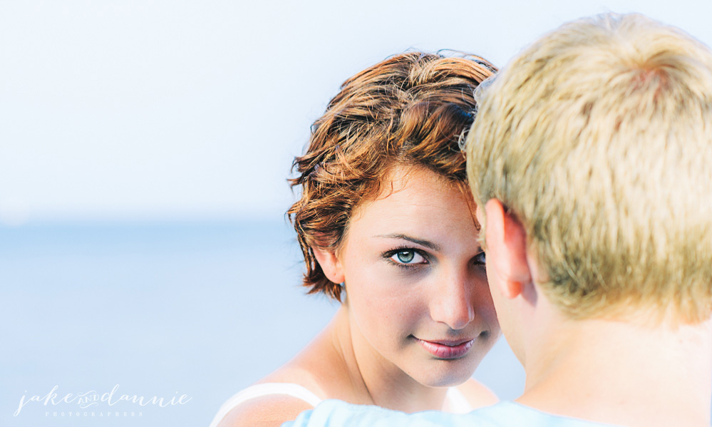
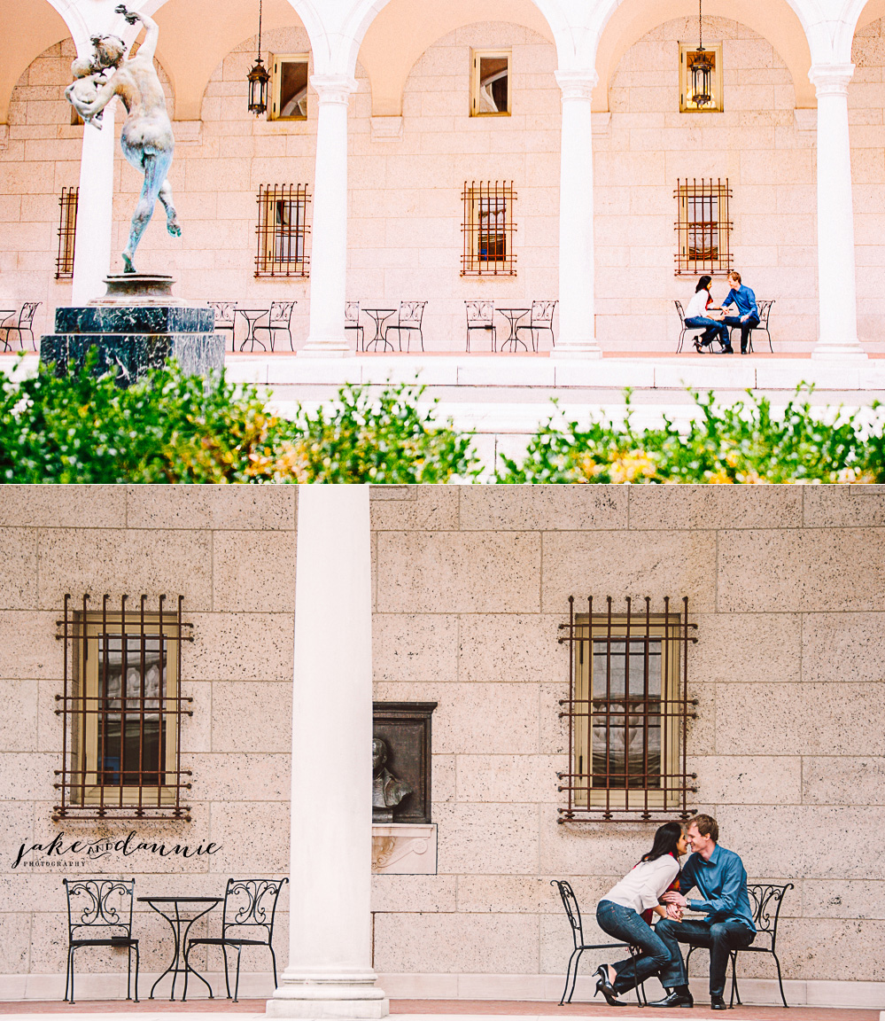
It might go without saying that larger objects and objects near the center of an image command more attention. For example, in the image above, the face of the lovely young woman is clearly the subject of the photo. Likewise, in the engagement photographs below we knew that the location had special significance to the couple so we deliberately minimized them and framed them in the lower right hand corner of the image. The result is that the scenery becomes more important in the eyes of the viewer.
5) Framing
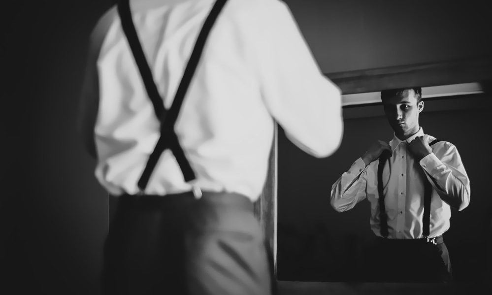
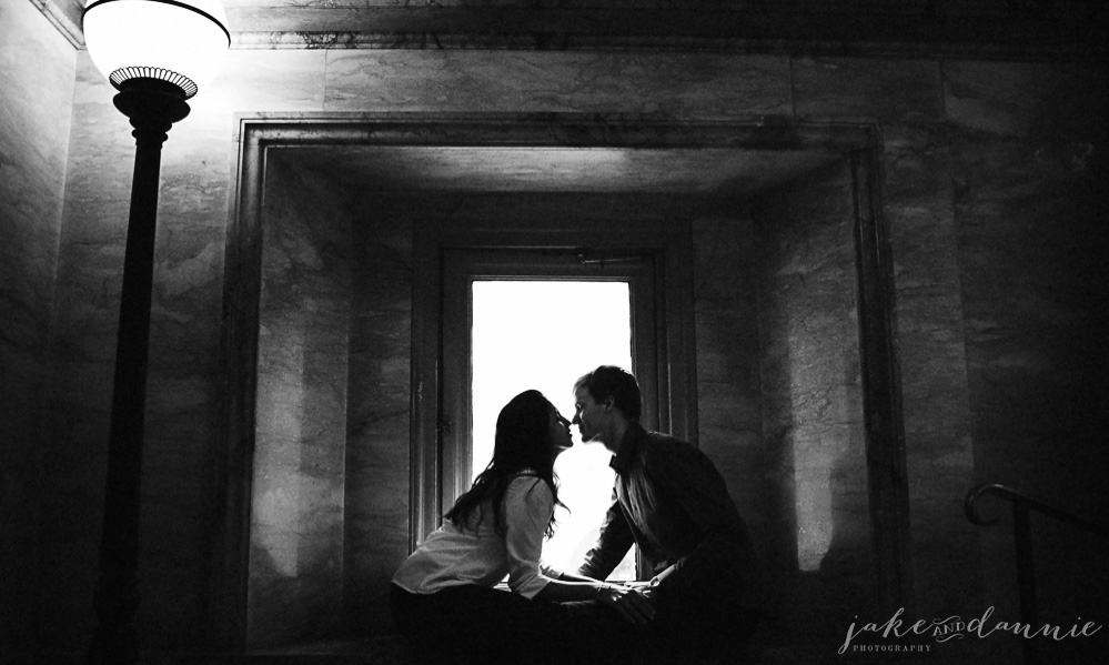
Just like putting a picture in a frame on the wall helps to separate it from everything else in the room, the famous “frame within a frame” can help to isolate the subjects of a photo. Above, the groom’s reflection is literally within the frame of the mirror, but below the couple is enclosed a little more abstractly by the bright window behind them.
Because your brain can connect the dots, frames don’t even have to be totally enclosed to be effective. Below, look how the branches and the bushes form only the upper right and lower left corners of a frame, but it still looks like the happy couple is enclosed in a box. Once you notice it, it’s hard not see it.
Of course there are exceptions to any rule, and the context of the photo will always play a huge role, but hopefully if you keep this guide in the back of your mind the next time you are taking photographs, you will have a little more luck capturing what is important to you or your clients the next time you are shooting.
Do you plan to use any of these techniques in your photography? If you do, let us know how it works out by commenting on this page.


